A Blue Jay Changes its Colors

I noticed yesterday that the Toronto Blue Jays baseball team introduced a new team logo. Normally as a baseball fan, I’ve gotten jaded about that, because mostly they just seem like cash grabs. Especially when the Blue Jays introduced a new team logo for the 2003 season already!
The logo above will be used starting in 2004. What puzzles me most about this change is that the team is announcing this now in September of 2003. They’re not using the logo on signage, online stuff, or anything until January 2004. So says their press release on the matter. Also, they’re not making the new logo stuff generally available until then. If that’s the case, then WHY announce it now? That doesn’t make any sense to me. If you’re going to announce a new team logo, then use it. I can’t comprehend why they’re announcing it now. It seems to me that post World Series would be the time to announce it.
Having said all that, I REALLY LIKE the new logo; I just question the timing of the announcement. It’s quite striking, and I think is very well done. I love the color scheme, as well as the design. It sort of reminds me of a combination of the Seattle Seahawks and the Arizona Cardinals logo, but that doesn’t really affect my liking it, it just kind of reminds me of those.
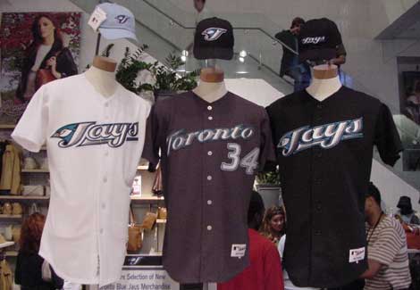
Below are the 2004 Blue Jay uniforms with the new colors/logos as well as the current 2003 logo, which apparently will only be around for one season.


Join the Conversation
These uniforms are absolutely DISGUSTING! The Blue Jays should be the BLUE JAYS, not the BLACK JAYS
They look stupid, glad I’m not a Jays fan!!