New blog layout
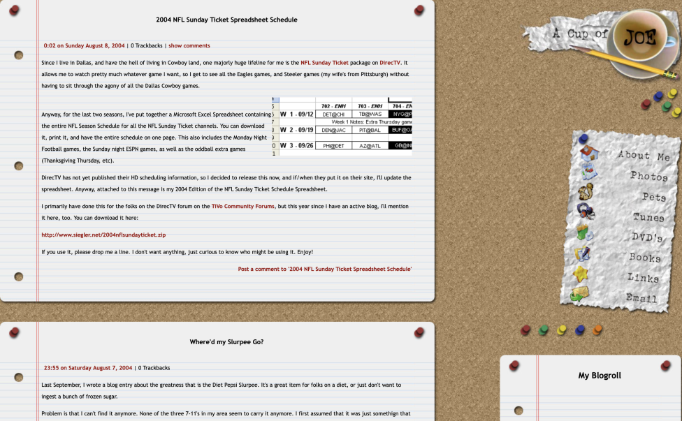
If you’re reading this, you’ve noticed my new blog look. This is something I worked up some time ago, but never actually launched, but today decided to go with it.
I haven’t totally finished it, some of the sub pages still aren’t finished, but I’m still working on that. So if you see some broken links, or pages that still look like the old blue layout, that’s why.
This is really designed if your monitor resolution is 1024×768 (or larger). If you’re at 800×600 or god forbid 640×480 (anyone still work that way), this isn’t likely to look terribly good.
Let me know what you think. Additionally, this version of the blog software doesn’t automatically post your comments, I have to approve them, that’s part of the blog comment spam defence.


Join the Conversation
Looks good, man!
I love it! You did a great, great job! :)