A Major Site Overhaul
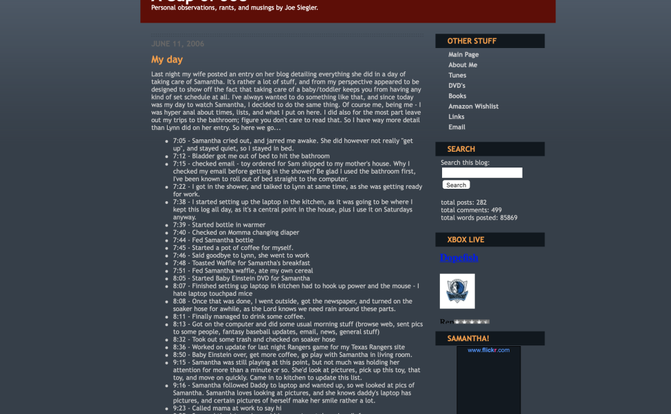
As you can see by reading this, I’ve had a major overhaul to my blog. While I was happy with the old look I had, there recently was a contest by Six Apart (the people who make the blog software) for folks to make new design layouts for the software. This contest is over, and they posted the winners. I looked about 7 or 8 of them, and considered several, but decided to settle with one called “The Late Show“.
This theme was the overall grand prize winner in the contest, but that is not why I chose it. I picked this one because of two things.
- It was one of the few “dark” themes I liked that weren’t too “busy”
- It used 100% of the screen
For some reason, blog software designers love to leave lots of dead empty space on either side of what they’re doing. I can never understand that. That wasted space just screams for content or for some other usage. That is the primary reason I chose Late Show over the others. A couple of the others that I almost went with were “Top Secret“, “Curves in Red“, “Parchment” , and “Road to October“. Road to October wasn’t a serious candidate (too thin), but it was Baseball themed, so I wanted to point it out.
It’s slightly modified, the Popcorn bag from the original has been replaced with a cup of coffee that has spilled over. Thought about a regular cup of coffee, but that’s been done, a spilt one is somewhat more interesting. Plus the CD subsection of the blog has it’s own custom graphic up there, one of compact discs, as that’s what that section is all about. Thanks to RedSplat for all the help in getting that done. I owe you – again.
I did drop one thing from the blog when I did this. My old links page. I never updated it, most of them are out of date anyway, and I just didn’t feel like messing with it. So it’s gone.
But this new style is here, and is one I’m pretty happy with. Let me know what you think by leaving a comment, eh? Thanks. :)


Join the Conversation
ME LIKES