Fix the Add-on Bar Location in Firefox 4 Beta 8
I’ve been using the Firefox 4 beta builds for awhile now, and previous to an hour ago, I haven’t had any problems with them. Beta 8 though posed a new one. Apparently in Beta 7, they removed the “status bar”, and replaced it with the “Add-on Bar”. Which doesn’t bother me so much, although it did take some time to train my eyes to look up top for where a link is going when I hover over it. That used to be on the bottom.
But Beta 8 really screwed things up. They changed it so that the icons that have always been on the lower right of the browser were now on the lower left. They’ve been on the right side since this code was in it’s ancient days Netscape Communicator. BAH! Look at what I mean.
It even makes the popups from the add-ons show up on the left, too. Can’t have that. I looked around online, and couldn’t find anything on how to fix it. Got mad. Then played around myself and found an answer. Here’s how to do it.

1) Right click on the add-on bar (assuming you have it activated, if you don’t do that first). Click Customize.

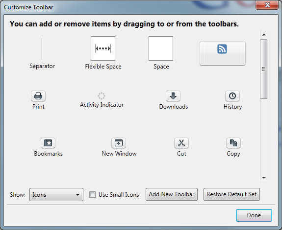
2) Drag the icon named “Flexible Space” from the Customize Toolbar shown below, and drag it to the left of the icons that are in the wrong spot.
3) It will leave a long empty bar to the left of the icons, which should now be pushed all the way to the right.
4) Click “Done”, and the big white bar will disappear, leaving the icons on the lower right where they should be.
One small caveat to that, the “X” which translates to “Close add-on bar” will remain – I don’t know if it’s possible to get rid of that. If you know a way, let me know.
Hope this helps, as I was rather shocked at this major design change after all these years. What were they thinking? (Unless it’s a bug where the variable space was left out, in which case never mind, but still…)


