A few thoughts on Google Inbox
I’ve spent some time with Google’s new Gmail client, Inbox. I’ve used both the desktop variant, and the iOS version. I have a few things I wanted to say about it. Before I do that, watch this video. It is the video that you are shown once you are able to log into the program. It gives you a better idea of how it goes about things than the more “fluff” intro video anyone can see.
Me and Inbox
First off, I have long subscribed to the concept of Inbox zero, and this definitely seems like it will help in that regard. The ability to group things together and deal with them all at once can be a help, especially in the morning check of email when all the overnight things pile up (especially subscriptions for things like Amazon Deals show up).
Second, for the last year or so I’ve been using the client “Mailbox” by Dropbox on my iOS devices. The primary reason for that is because of their deferred mail option, something that I find a real life saver. I’ve used it to just defer things to Monday, and I’ve used it to defer things six months down the road, where I’d have no hope of remembering what it is I do (like buying a Christmas item in September that I deferred from the previous December). So I VERY MUCH love that concept.
So I checked out Inbox, and I very much like the interface. In fact, it has already graduated to primary email client in the “permanent” row of icons on my phone.
Desktop Interface
The desktop version has two issues I can see interface wise.
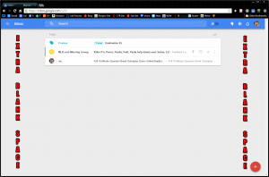
1) There’s an enormous amount of blank space on either side of the column of messages. You can’t expand it wide, so what is the space for? The only thing I see is column advertisements which would be an immediate turnoff – or the use of ad blocking software. It’s not a deal breaker, but I hate website interfaces with wasted space like that. I don’t mean to junk it up with crap, either, but let me expand out to 100% width if I want to.
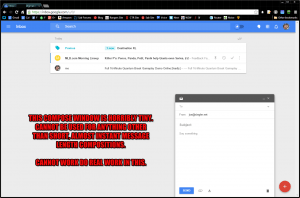
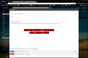
2) THE HORRIBLY USELESS COMPOSE BOX. When the current compose box on regular Gmail was first brought into being it looked like this. This tiny little corner thing, like it is nothing more than an instant message. That horribly useless, tiny inbox is simply impossible to use for any real email composition. Google learned that lesson with the attempt to put this inbox in the regular Gmail, and relented. Looks like they’re trying to force it down our throats here again. Only in this version, there is no “full screen” option you can even choose manually. It’s tiny compose window or nothing.
The tiny email compose window is so much of a dealbreaker, it has stopped me from using the desktop client at all beyond checking to see if I have any invites for people. I was REALLY hoping they wouldn’t be this stupid with the compose box, but apparently they intend to try this path again. If it doesn’t change, I won’t use the desktop version. You simply cannot have an compose box THAT SMALL and get any real work done. When one has a job that requires them to live and operate in Email, this is where I spend an enormous amount of time.
Having said all that, if there is a way to get the larger compose box, let me know, and I will rescind my foaming at the mouth. If this is the case, someone tell me, please.
One of the things I used to do all the time in email is send emails to myself as “to do” type msgs. They’d sit there until I did them. Well, with the combination of reminders and snooze, you can give yourself a reminder, and then make it come back when you really want to do it. I like that. A LOT. I think this is one of the few things that works better in the desktop version than the iOS/mobile version. I’ve already made extensive use of this, it might be my favorite feature set of Inbox to this point.
iOS version
Regarding the iOS version, I’m quite happy with that. The only real thing I wish they’d do, which i admit they’re unlikely to do is this..
Let me change the swipe behaviour so that if I swipe far enough I’m given an option to delete vs just merely “mark done” (aka archive it). There are a lot of emails I get that I don’t need or want to save. Yes, I know I can delete them, but it requires me to have a few extra steps to do that. I also realize I’m describing the way that Mailbox handles archive/delete, but it works. I know it works as I’ve been using it for over a year. I also know Google tends to discount the concept of delete in their email programs, but it is a viable thing. You don’t want to just archive temporary emails you send to yourself for later need. You don’t want to keep copies of all the notifications you get from forums saying someone replied to your post, and how many times have you looked at the daily Groupon offer 9 months down the road? There are times when you need to delete things. I really wish Google would do this with the Inbox interface, it would make things more streamlined when you want to delete things.
Things I wish it did
A couple of these are repeats from further up, but I wanted to put them all in the same place.
- That it would work with both Google Apps Email (which I’ve read is coming). I have a few domains I maintain for clients and whatnot that use GApps Email. Can’t use it with them.
- Relative to #1, letting my install work with multiple accounts at the same time. This is probably dependent on #1 happening first. As it stands I’m using Inbox for my primary Gmail account, and still using Mailbox for everything else.
- Change swipe behavior so that you can do mark “done” as well as delete. I really don’t need to save most of the “daily deals” emails from Amazon and the like. Letting me delete would be a lot better than just saying “Done” (aka archive).
- Get rid of the freakin’ minuscule compose box on the desktop version. Needs to be like it is on regular Gmail.
- Likewise, get rid of all the dead space on the desktop to the right of the email column. Hate dead space, makes you want to go full screen to have more real estate.
iPad specific layout. Right now I’m using the 2x sized iPhone one there. It’s not awful, but native iPad interfaces always look better.Saw on Twitter where they’re already working on an iPad/Tablet version.- SIGNATURES! Added in after the fact, I just realized there’s no signatures in this.
- When you mark something as “done”, it would be awfully nice if it was also marked as read as well. Right now swiping stuff as “done” leaves an awful lot of unread messages scattered through my mail archives.
Despite these wants, this is a’ VERY strong start for me. I’m quite happy with the client, and hope it is improved upon for future versions.
UPDATE: Google discontinued the Inbox program on March 2019. They just cut it – which pissed off a lot of people at the same time. A handful of features were rolled into regular Gmail, but not all of them, and I wish they would have done so. But the fact that some of the more useful features are still MIA in proper Gmail in 2022 means I’m still missing this one. L(


Join the Conversation
I agree with so much of this! Grr, my biggest gripe is that ridiculous compose popup – why the letterbox size Google?!